-
LINKEDIN
-
EMAIL
-
TWITTER
-
FACEBOOK
Charting International Labor Comparisons - Labor Force
2014 Edition
21 Mar. 2014
Back to ILC Homepage
Chart 3.
Click legend to hide and show years. Hover over data bars to show data for each year.
Chart 3: Unemployment rates adjusted to US concepts (1996–2012)
Joblessness in most countries shown in Chart 3 exhibited a U-shaped trend during the last decade. The bottoming out of unemployment rates before the 2008–2009 global recession was followed by large increases. Unemployment rates in 2012 were greater than prerecession levels in all countries compared except Germany, Turkey, and South Korea. However, labor markets in countries outside of Europe, including the United States, Canada, and Japan, showed signs of recovery in recent years. Although Germany experienced record low unemployment in 2012, labor markets in other parts of Europe continued to struggle. Unemployment rates in Spain, Italy, and the Netherlands, for instance, showed an upward trend after the recession and through 2012.
Chart 4.
Note: For Canada, Spain, Sweden, the United Kingdom, and the United States, “teenager” refers to anyone between the ages 16 and 19. For Mexico, “teenager” refers anyone between the ages of 14 and 19. Youth unemployment refers to teens and young adults who do not have a job, are actively seeking work, and are available to start work.
Source: The Conference Board, International Labor Comparisons program
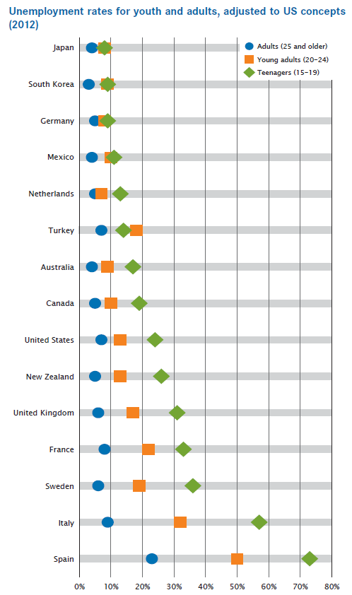
Chart 4: Unemployment rates for youth and adults, adjusted to US concepts (2012)
Unemployment rates for youth (teenagers and young adults) are generally higher than those for adults, partly because youth have lower levels of education, skills, and work experience. They are, therefore, more vulnerable to economic downturns.
Among the countries compared in Chart 4, youth unemployment rates are highest in southern Europe. In Italy and Spain, for example, youth unemployment rates in 2012 topped 50 percent for teenagers and exceeded 30 percent for young adults. In Germany, on the other hand, youth joblessness is less pronounced, partly due to a formal apprenticeship program that provides young persons with on-the-job training and job placement opportunities. However, such apprenticeship programs or similar safety nets for youth are rare in other countries, and youth generally run higher risks for joblessness and prolonged unemployment.
Chart 5.
Note: Employment population ratios are adjusted to US concepts. Agriculture includes agriculture, forestry, hunting, and fishing. Industry includes manufacturing, mining, and construction. The services category includes transportation, communication, public utilities, trade, finance, public administration, private household services, and miscellaneous services. Data for the Netherlands, the United Kingdom, and France refer to 1975-2012. Data for Spain refer to 1980-2012.
Source: The Conference Board, International Labor Comparisons program
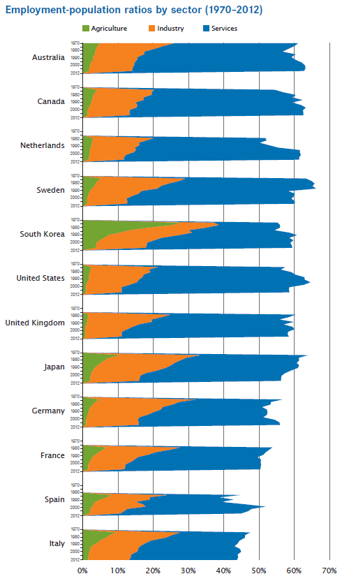
Chart 5: Employment-population ratios by sector (1970–2012)
Over the past 40 years, the percentage of the working age population employed has remained above 50 percent in almost all of the countries compared in Chart 5, but the share of those employed in each sector has shifted over time. The share of the working age population employed in agriculture dropped by more than half in all countries compared except the Netherlands, and the share of the working age population employed in industry fell in all countries except South Korea. In contrast, the share of the working age population employed in services increased in all countries compared and was near 40 percent or above by 2012 in all countries except Spain and Italy.
Chart 6.
Click legend to hide and show countries. Hover over data points to show data for each country.
Chart 6: Labor force size and participation rates by sex (2012)
Labor force participation rates provide information about what percentage of the working age population is employed or actively seeking work. Labor force participation rates are higher for men than women in all countries compared, but relatively fewer women are working or actively seeking work in Turkey (27.2 percent) and Mexico (42.0 percent). On the other end of the spectrum, men and women are much more evenly engaged in the labor forces of Canada, New Zealand, and the United States, which have among the highest overall rates of labor force participation.
Chart 7.
Note: Participation rates for men and women are a percentage of the total male or female working age population. Data for Mexico refer to 2005-2012, data for South Africa refer to 2008-2012, and data for Turkey refer to 2006-2012.
Source: The Conference Board, International Labor Comparisons program
Previous Section: Gross Domestic Product (GDP)
Next Section:Competitivenes in Manufacturing
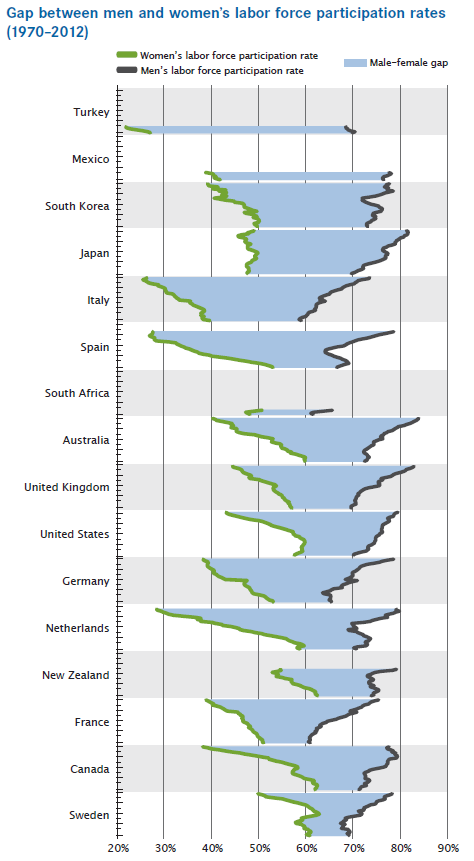
Chart 7: Gap between men and women’s labor force participation rates (1970–2012)
Men continue to have higher rates of labor force participation than women, but the gap between the two has been narrowing over the past 40 years in all countries compared in Chart 7. In most countries, this is due to a combination of a decreasing rate of participation for men and an increasing rate for women. In 2012, the gap between the sexes was narrowest in Sweden, Canada, and France, and widest in Turkey, Mexico, and South Korea. Mature economies generally have a smaller gap than emerging economies, with the exception of Japan. Among mature economies compared, Japan has the largest gap due to a declining male labor force participation rate over the last 40 years, while the rate for women has remained roughly stable (between 45 and 50 percent). In contrast, South Africa has a small gap for an emerging economy due to its relatively low rate of participation for men.
The use of all TCB data and materials is subject to the Terms of Use. Reprint requests are reviewed individually and may be subject to additional fees. TCB reserves the right to deny any request.